I added price to the front cover


To make my magazine look more professional, I added ISSN code and some other information to the publication details.


The ‘hurry up!’ letter were overlapped with the poster, so I had to rearrange it.
I added price to the front cover
To make my magazine look more professional, I added ISSN code and some other information to the publication details.
The ‘hurry up!’ letter were overlapped with the poster, so I had to rearrange it.
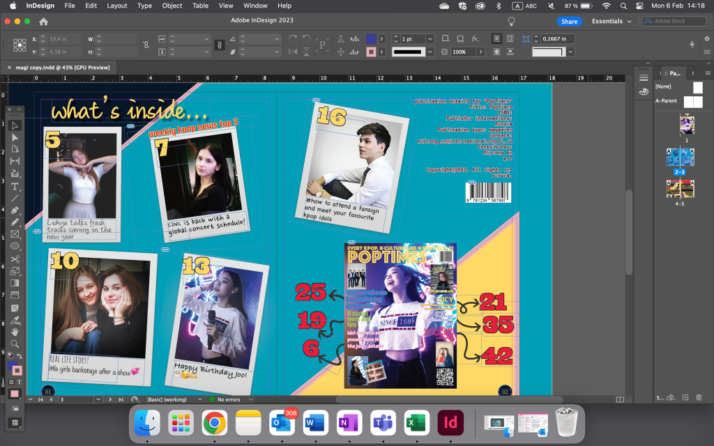
My teacher advised me to change the colour of one of the sell line and move the picture at the top a little down (so that it doesn’t touch the masthead). So, I changed the colour from bright green to blue with black outline.


My teacher advised me to change some bits of my magazine. So, here are some updates.
I changed some things in the contents page;
I added some emojis and as I didn’t like the bit at the top of the page, I tried to put a square.
For the requirements my teacher suggested me, I delated the picture at the top right and inserted publication details instead.
For the double spread page, I put the journalist information (for the main article)
For the cover page, I put some shadows behind the puffs.
And I corrected some mistakes on the cover page


This is the process of editing the third cover picture. I used brush to get rid of the sofa and bags at the bag. And I used other tools to increase the contrast.
I edited some polaroid pictures again because some of them had white background. So, I used photoshop to get rid of it. Then I added shapes at the edge for the page numbers.
I asked my friend to send me some pictures of her selfies for one of my article. This is the process of editing.
I tried to test with different shapes of blobs and I ended up with this


Finally, I finished the contents page. I tried with many different design. I added shadow for ‘what’s inside…’. Then I tried to put the page numbers on the bottom of the polaroid but it looked too small and I believed it was too small to be seen by the readers. So, for the second trial, I put the page numbers at the top of the polaroid, and put some sentences at the bottom (of the polaroid). Plus, I put ‘weekly kpop news top 3’ to indicate the readers who need that information.
I added the cover page in the second half of the double page and used the arrows to indicate the page number.
To print the magazine, I saved it as pdf.

This is the final product.
As I finished the front cover, I designed the double pages. I used indesign to design my magazine as it focused on book making. This is the page set up.

For the contents page, I used polaroid template and eddited the pictures inside so that it would look like an album. For the pictures that would go in the magazine, I used photoshop. Here is the process.
I eddited the backstage as a background. Then I changed some lightings (contrast, colour of the light)


I put the template on the picture.

For these, I change the curve and brightness. Then I used air brush to make the edges dark and the centre brighter.


For this photo, I used unsharpening mode to make it clearer (the original one was to blurry). Then I put white background and repeated the steps I did for the previous one. This is the final version.

I forgot to take screenshots for this one but I repeated similar steps to the previous photo.


As I didn’t want to cut the picture, I distorted the template.
Then I used air brush to brighten the centre.

background links

For the last picture for the contents page, I decided to put another picture of him. I used brush with low hardness and opacity.

This is the final version. I’m going to add some sentences under the picture.

For another double spread page, I put the articles and some pictures as planed.
Here is the process
I put the pictures in the blobs to make it fit to the articles


This is the final draft 1, for draft 2, I’m planning to change the cover picture, add some sentences in the cover page and add some spaces for page number.
This is the second draft for my front cover. I tried with different image that would make my magazine look more like music themed.
I also changed the font of the headlines and added one puff.
For the next draft, I’m going to add more puffs and may be some headlines.

I used photoshop to make the front cover. Here is the setting of the page.

I put; barcode, mast head, sell line, publish date, cost, some headlines.

it has different colour of headlines so that the audience knows that each of them are about different group. I’m going to add puff and may be change the background.
When editing photos, I used light room to change the lightings and colours, and to help with choosing the photos.


I increased the exposure, contrast, highlights, shadows. And decreased whites, blacks

I increased blue and pink tint.


I increased exposure, contrast, shadows, and decreased highlights, whites

increased blue, pink tint, and vibrance. I decreased saturation


For this photo, I increased exposure, highlights, shadows, whites and blacks. And decreased contrast

I increased the cold light and pink tint. And left the vibrance and saturation as it was.
I used adobe light room to choose the photos I like. And to crop, change the lightings and colour


I increased the exposure to make it look like it is taken from a studio.

I increased those to make it look colourful just like many of the kpop idol photos

After making the picture bright, it looked a bit blurry, so I increased sharpenings in detail.


For this photo, I made bigger contrast and made it look brighter so that it looks like studio photo.

I also increased the vibrance of this photo as well

After making the picture bright and colourful, it looked a bit blurry, so I increased sharpenings in detail.

I planned to use the photos I took in the party room for the contents page, on the last page. Here are the original version of the photos that I liked;
First I started with getting rid of the useless stuffs in the pictures and make her more visible such as sofa and cushion. So, for the first picture, I ended up with 5 versions.
I wasn’t sure which one to use, so I asked some people in my media studies class and one of them said that I need to cut out the neon light at the back so that it looks more like she is on a stage.

After cropping the pictures, I used light room to choose which one to use.


For this photo, I didn’t edit any lightings or colours but I increased sharpening and noise reduction as I thought the picture was a bit blurry.


For this photo, I increased the contrast, shadows and blacks in order to get bigger contrast between red and blue.

Since the photo looked blurry, I increased sharpening and noise reduction.


for this photo, I didn’t change the lightings and colours, but I tried to get rid of the things that would make it look like a room. I wanted to make the picture as if she is on the stage. So, I used brush to paint on the coach, cushion, bags and edge of the room. In addition, I brightened the edge of the model’s hair.